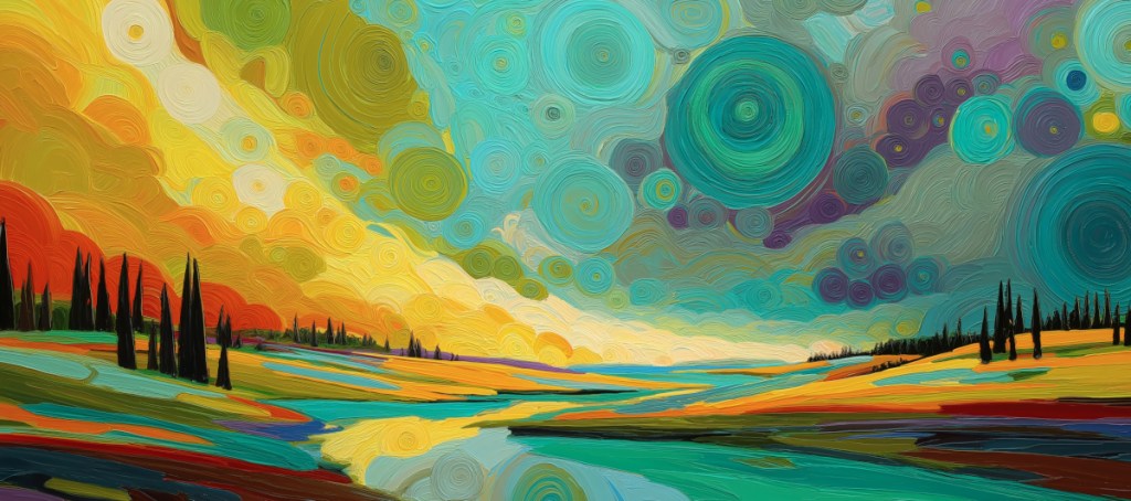
In this latest release, The Swirling Valley, I’ve moved away from the quietude of minimalism into the exhilarating world of maximalist expression. While the style is reminiscent of Western post-impressionism, the soul of the piece is still rooted in the daring combinations found in Sanzo Wada’s Dictionary of Colour Combinations.
The Power of the ‘Triple Harmony’ This piece utilises a classic Japanese “triad” approach to colour, balanced for high impact:
- The Grounding Teal (Seiheki): Using deep greens and teals in the valley provides a cooling effect that allows the eye to rest amidst the chaos of the sky.
- The Radiant Yellow (Kihada): Representing the energy of the sun, these yellow impasto swirls evoke optimism and focus.
- The Emotional Violet (Shion-iro): By tucking violet and plum tones into the swirling clouds, we add a layer of mystery and depth that prevents the brighter colours from feeling overwhelming.
In Japanese colour theory, balance isn’t just about matching; it’s about the proportion of energy. By using the dark silhouettes of the trees to break up the saturated fields, we create a rhythmic “visual breath” that makes this bold piece feel harmonious in a modern home.
Style Guide: Saturated Serenity – How to Decorate with “The Swirling Valley”
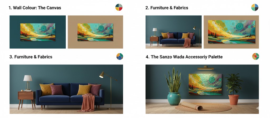
To make this artwork truly “pop” without overwhelming a room, you need to play with the contrast of texture and tone. Here is how to style a space around the Swirling Valley palette:
- Wall Colour: The Canvas
- The Bold Choice: A deep Teal (Seiheki) accent wall. This will make the oranges and yellows in the painting vibrate with energy.
- The Sophisticated Choice: A soft Warm Grey or Oat. This acts as a “gallery” backdrop, allowing the impasto textures to take centre stage.
- Avoid: Stark, cold whites. They can make the rich oil-paint aesthetic look too “flat.”
- Furniture & Fabrics
- Velvet is King: Pair this print with a Navy or Forest Green velvet sofa. The sheen of velvet mimics the light-catching ridges of the impasto brushwork.
- Natural Wood: Use Mid-Century Teak or Walnut furniture. The orange undertones in these woods harmonise perfectly with the sunset swirls in the art.
- Statement Textiles: Throw pillows in Mustard Yellow or Plum (inspired by the Shion-iro violet in the sky) will tie the whole room together.
- Lighting: Highlighting Texture
- Directional Picture Lights: Because this piece is inspired by thick oil paint, use a warm LED picture light. The shadows created by the “texture” will add a 3D effect to the print.
- Brass Fixtures: The gold tones of brass or brushed gold lamps will complement the sun-drenched yellows in the valley.
- The “Sanzo Wada” Accessory Palette
- Ceramics: Hand-glazed pots in Turquoise.
- Rug: A neutral jute rug with Terracotta stitching.
- Plants: Tall, architectural plants like a Snake Plant or Fiddle Leaf Fig to mirror the dark, vertical cypress trees in the print.

Leave a comment