
Why Moody Purple Seascapes are the Interior Trend You’ve Been Missing
For years, coastal decor has been synonymous with bleached woods, nautical stripes, and bright turquoise waters. It’s a classic look, but as we move into 2026, the design world is craving something deeper, more soulful, and arguably more sophisticated. Enter: The Midnight Coastal Aesthetic.
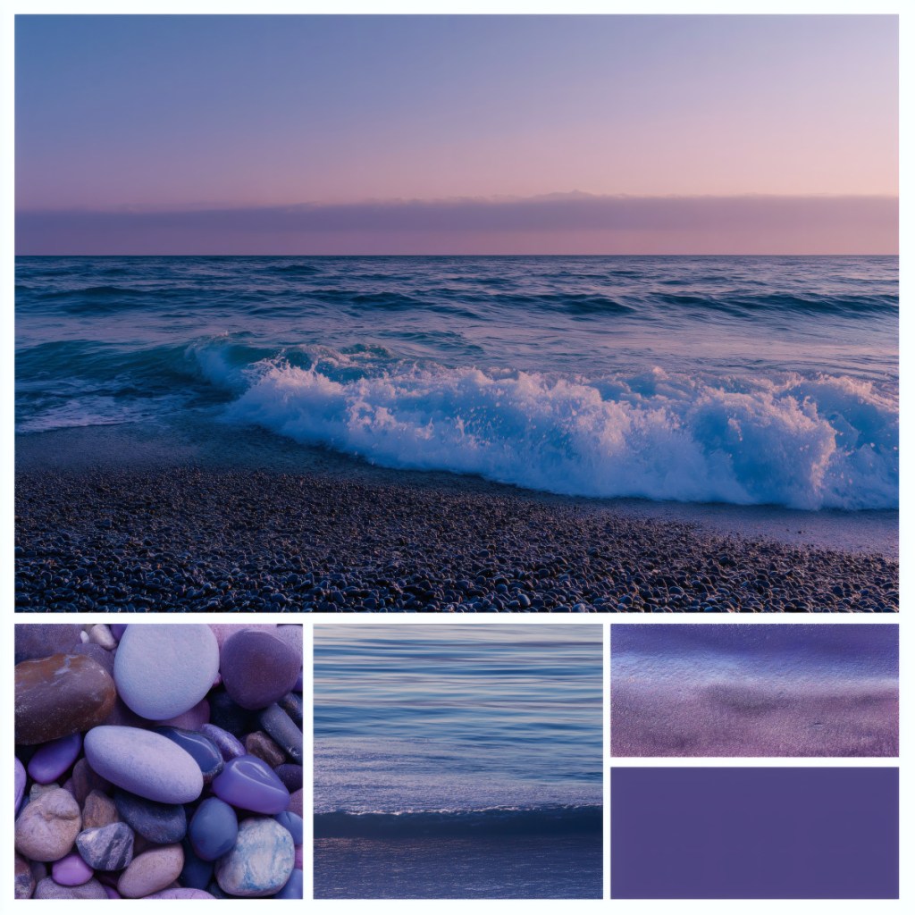
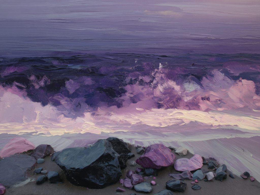
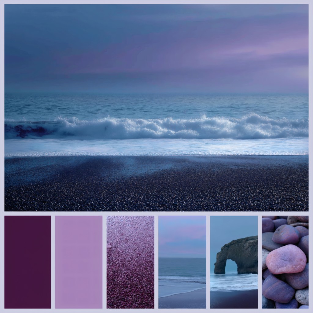
This movement swaps the midday sun for the “Blue Hour”—that ethereal moment just after sunset when the sky turns to velvet and the ocean reflects shades of plum, lavender, and slate. Our latest collection, The Violet Tide, is a love letter to this fleeting, atmospheric magic.
The Psychology of the Palette
Colour theory tells us that purple is the bridge between the physical and the spiritual. By blending the calming stability of blue with the fierce energy of red, you get a spectrum of violets that are scientifically proven to encourage introspection and lower heart rate.
In this collection, we move from a grounding Imperial Plum (seen in the deep shadows of the shingle beach) to a soft, ethereal Lavender Mist in the sky. When you hang these tones in your home, you aren’t just adding a picture; you are installing a “mood regulator.” It’s the visual equivalent of a deep, cleansing breath at the end of a long day.
The ‘Violet Tide’ Style Guide
How do you integrate such a specific, moody palette into your existing home without it feeling overwhelming? It’s all about balance and texture.
1. The Foundation: Furniture & Metals To let the deep violets of the Violet Tide print truly sing, pair them with “quiet” furniture. Think light-coloured woods like bleached oak, ash, or silver birch. These natural textures provide a high-contrast backdrop that makes the purple tones pop.
- Pro Tip: If you want a more luxurious, “Dark Academia” feel, go bold with velvet furniture in navy or forest green. The jewel tones will harmonise perfectly.
- Metals: Avoid yellow gold. Instead, opt for brushed silver, pewter, or cool chrome. These metals mimic the cold, shimmering light of the sea spray.
2. Layering Textiles Texture is the secret sauce of coastal styling. Look at the pebbles in our collection—they are smooth, rounded, and matte. Mirror this in your room by incorporating:
- Linen Throws: Choose “Dusty Rose” or “Slate Blue” to bridge the gap between the sky and the water.
- Rug Choice: A grey jute or seagrass rug adds that “shingle beach” grit and grounding texture underfoot.
3. Lighting the Scene Because this artwork represents twilight, it looks best under “warm-dim” lighting. Avoid harsh overhead LEDs. Use floor lamps with linen shades or even amber-tinted bulbs to enhance the purple hues and create a sanctuary-like atmosphere.
Final Thoughts
The ocean isn’t always bright and breezy; sometimes it’s moody, mysterious, and deeply peaceful. Bringing the Violet Tide into your home is about embracing that mystery. It’s about creating a space that doesn’t just look good, but feels like a sanctuary.

Leave a comment